A world where a simple logo can tell a story spanning over a century. The Pepsi logo history is a testament to how design evolves, adapting to cultural shifts and consumer preferences.
From its humble beginnings to the modern-day emblem we recognize today, the journey of Pepsi’s branding is both fascinating and insightful.
This article takes you on a visual tour through time, exploring the significant transformations that have shaped this iconic logo. As we delve into the vibrant past of Pepsi, you’ll discover how each redesign reflects the era it belongs to, providing a refreshing perspective on the power of branding.
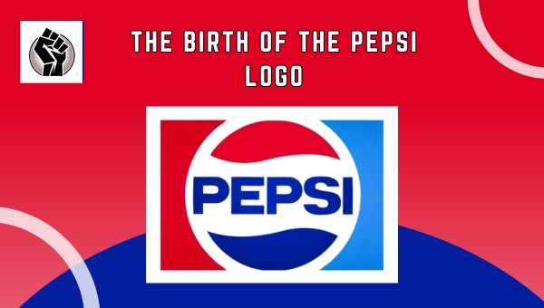
The Birth of the Pepsi Logo
The Pepsi logo has a fascinating origin dating back to 1898 when it was first created. Initially, the logo featured the name “Brad’s Drink,” which was the original name of the beverage.

This name was soon changed to “Pepsi-Cola” in 1898, inspired by the pepsin and kola nuts used in the recipe. The first logo was quite simple, comprising elegant script typography that highlighted the brand’s name.
This design choice was reflective of the era’s artistic trends, favoring intricate and decorative elements. Over the years, the logo began to evolve, yet the foundational elements set during its inception remained significant.
The early design laid the groundwork for future innovations, marking the beginning of a visual journey that would see the Pepsi logo transform into an iconic symbol recognized worldwide. This humble start was a stepping stone for the brand’s identity.
Also Read: Michael Jackson Pepsi Partnership: A Game-Changer in History
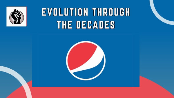
Evolution Through the Decades
Pepsi’s logo history is a fascinating journey through time, reflecting broader trends in design and culture. Each decade brought new influences and changes, shaping the logo into what we recognize today. Let’s delve into the transformations that occurred during the 1940s through the 1970s.

The 1940s and 1950s
During the 1940s and 1950s, the Pepsi logo underwent notable changes that mirrored the era’s artistic influences. The design of this period was marked by a shift towards a more patriotic theme, incorporating elements that resonated with national pride.
The logo featured a bottle cap design, a clever nod to the product itself, and introduced the iconic red, white, and blue color scheme. These colors were not just visually striking but also symbolized the brand’s American roots. This era laid the foundation for a recognizable brand identity, setting the stage for future evolutions.
The 1960s and 1970s
The 1960s and 1970s were transformative years for the Pepsi logo, as the brand embraced more modern and dynamic design elements. This period saw a departure from the traditional bottle cap motif, opting for a sleeker and more abstract representation.
The logo’s typography was also modernized, reflecting the youthful spirit of the time. During these decades, Pepsi sought to appeal to a broader audience, capturing the cultural shifts and trends that defined the era. The changes were a testament to Pepsi’s adaptability and commitment to staying relevant in a rapidly changing world.
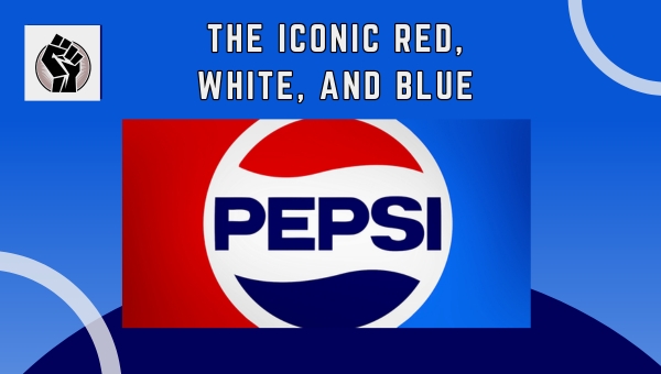
The Iconic Red, White, and Blue
The colors red, white, and blue have become synonymous with Pepsi, representing more than just a drink. These colors have been central to Pepsi’s identity, encapsulating its American roots and evoking a sense of patriotism.

But how did these colors come to be such a significant part of Pepsi’s branding?
Introduction of Three Colors
The introduction of red, white, and blue into the Pepsi logo was a strategic move that reinforced its brand identity.
These colors:
- Red: Symbolizes energy and passion, reflecting the brand’s dynamic nature.
- White: Represents purity and simplicity, aligning with Pepsi’s promise of quality.
- Blue: Conveys trust and reliability, building a strong connection with its consumers.
Revolutionary Design Changes
Throughout its history, Pepsi has undergone major design shifts that highlighted these colors.
These changes include:
- 1962 Redesign: A bold move that integrated the colors more prominently, enhancing brand recognition.
- 1991 Update: Introduced a more modern look, with refined color balance to appeal to a global audience.
- 2008 Refresh: Adopted a sleeker, minimalist design that continues to emphasize these iconic colors, aligning with contemporary design trends.
Modern Logo Redesigns
The journey of Pepsi’s logo continues to evolve as the brand adapts to modern design trends. In recent years, the focus has shifted towards minimalism, a trend that emphasizes simplicity and clarity.
Let’s explore how these minimalist trends have shaped the current look of Pepsi’s logo and its significance in the brand’s identity.
Influence of Minimalism
Over the past few decades, minimalism has become a driving force in logo design. This trend is characterized by stripping away unnecessary elements to focus on simplicity and clarity. Pepsi embraced this approach, refining its logo to feature cleaner lines and a more straightforward design.
By simplifying the elements, the brand aimed to create a logo that is easily recognizable and versatile across various platforms. This shift towards minimalism not only modernized the logo but also helped maintain its relevance in a fast-changing visual landscape.
Current Logo and Its Impact
The current Pepsi logo is more than just a simple design; it is a symbol of the brand’s identity. This logo features a clean and modern look that aligns with contemporary design preferences. The simplicity of the design helps consumers instantly recognize the brand, ensuring strong brand recall.
Moreover, the logo plays a crucial role in reflecting Pepsi’s core values of freshness and dynamism. By maintaining a consistent yet modern appearance, Pepsi reinforces its position as a leading global brand, showing its ability to adapt while staying true to its roots.
Also Read: Blueberry Pepsi – The Bold Flavor Adventure
The Pepsi Globe Symbolism
The Pepsi Globe has become an emblematic part of Pepsi’s identity. Introduced in the 1990s, it reflects a blend of modern aesthetics and the brand’s rich history. The globe comprises three swirling colors: red, white, and blue.
These colors not only echo the American flag but also symbolize global unity and Pepsi’s international presence. The circular shape represents the world, suggesting Pepsi’s aim to connect with audiences worldwide.
The design also incorporates a wave-like pattern, conveying a sense of movement and energy. This aligns with the brand’s dynamic and lively image. Over the years, the globe has evolved, yet its core symbolism remains steadfast.
Its simplicity and elegance appeal to a contemporary audience while honoring traditional elements. The Pepsi Globe continues to be a visual testament to the brand’s ongoing journey and its commitment to innovation and global reach.
FAQs
What is the origin of the Pepsi logo?
The Pepsi logo originated in the late 19th century when the drink was first introduced as “Brad’s Drink” in 1893. It was later rebranded as Pepsi-Cola in 1898, and the logo has evolved significantly since then.
How has the Pepsi logo changed over time?
The Pepsi logo has undergone numerous redesigns to reflect changing design trends and brand strategies. From the original script logo to the modern minimalist design, it has adapted to maintain relevance and appeal.
Why are red, white, and blue important in the Pepsi logo?
Red, white, and blue became central to Pepsi’s branding in the 1940s, aligning with patriotic themes and creating a distinct visual identity that stood out in the market.
What is the significance of the Pepsi globe?
The Pepsi globe symbolizes the brand’s global reach and modern appeal. It represents motion and dynamic energy, aligning with Pepsi’s image as a youthful and vibrant brand.
Conclusion
Pepsi’s logo history is a captivating journey that mirrors the brand’s evolution and adaptation over time. From its inception to modern redesigns, each logo change reflects broader cultural and design trends. The iconic red, white, and blue colors have become a staple of Pepsi’s identity, symbolizing its vibrant spirit.
The Pepsi globe further reinforces the brand’s global reach and connection with consumers. By understanding this visual journey, we gain insight into how design shapes a brand’s legacy.
For more fascinating insights into branding and design, explore our other blogs on the site. Discover more stories behind iconic logos and their evolution!


